What is Storybook?
Storybook is a popular tool for creating component libraries. With Storybook, the frontend components that your team builds become accessible via a web browser. This means that you can browse available components without setting up the development project.

At Whitespace, we use Storybook to enable reuse of frontend code and design patterns. We have created a component based frontend foundation that can be reused time and time again. Essentially, this means that each new Whitespace client benefits from the work we have done in previous project. For clients with a broad multi-channel digital presence, the reuse of patterns and components have a tangible impact on quality, brand consistency and time to launch for new features.
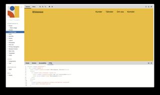
Storybook makes quality audits easier. We frequently work with clients that are legally required to adhere to WCAG accessibility guidelines. With Storybook, we can run automated accessibility tests as part of our development process. In addition, our accessibility specialists get easy access to all components at once, which makes their work easier.
Storybook is built with React, but works with several templating languages. At Whitespace, we frequently build sites with Gatsby, which means that Storybook is a good fit. It is worth noting that Storybook currently has no support for Blade. If you build sites with Laravel, Storybook may not be a good choice.
There are several tools for building component libraries. In addition to providing the features that we require, Storybook has an active community. Whitespace has created an HTML Addon for Storybook, which currently has nearly 100 000 downloads.